Brand Fundamentals
Home » Brand »
A brand is a combination of tangible and intangible assets that secure customer loyalty and foster relationships.
Our vibrant brand is made up of a number of carefully chosen elements that assist us in our strategic positioning.
Our brand is informed by our brand philosophy, brand platform, brand promise and brand objectives. These elements, which are discussed in this section, assist in defining and directing what the UJ brand stands for and what we need to communicate about it. These elements are uniquely developed for UJ, successfully set our brand apart from others, and should be used in all brand communication elements.
Our logo reflects everything our university stands for, namely cultural diversity, stature, global diversity and academic excellence. The striking imagery, colours and textures represent Johannesburg’s character and landscape, and all the elements portray a sense of liberty and unity, a celebration of the human spirit, and a fresh new energy.
The two birds facing one another represent the union between the two respected institutions that brought about a new and powerful force. They represent freedom – the freedom to live your potential, to explore all possibilities (on academic, personal and social levels), and to inspire you to reach for the sky. In short, to be part of a movement that is “co-creating solutions for humanity.”
The image of the open book, created by the space between the two birds within the logo, also symbolises a blank slate upon which students and staff may write the script for their futures. This also represents the book of knowledge – the continual development and renewal of knowledge, as well as the infinite nature of the learning process.
The abstract element between the birds’ heads denotes the torch of learning – symbolic of diversity and the comprehensive range of different qualifications offered by our university.
Knowledge transforms people and people transform the world. It is therefore the quality of our thinking that determines the quality of our society. UJ aims to give staff and students the freedom to live their potential and explore the totality of possibilities. People are only limited by limited minds. UJ aims to set them free.
This aim is expressed as our brand philosophy: “Co-creating solutions for humanity.”
UJ brand platform
Our vision is to be an international university of choice, anchored in Africa, dynamically shaping the future.
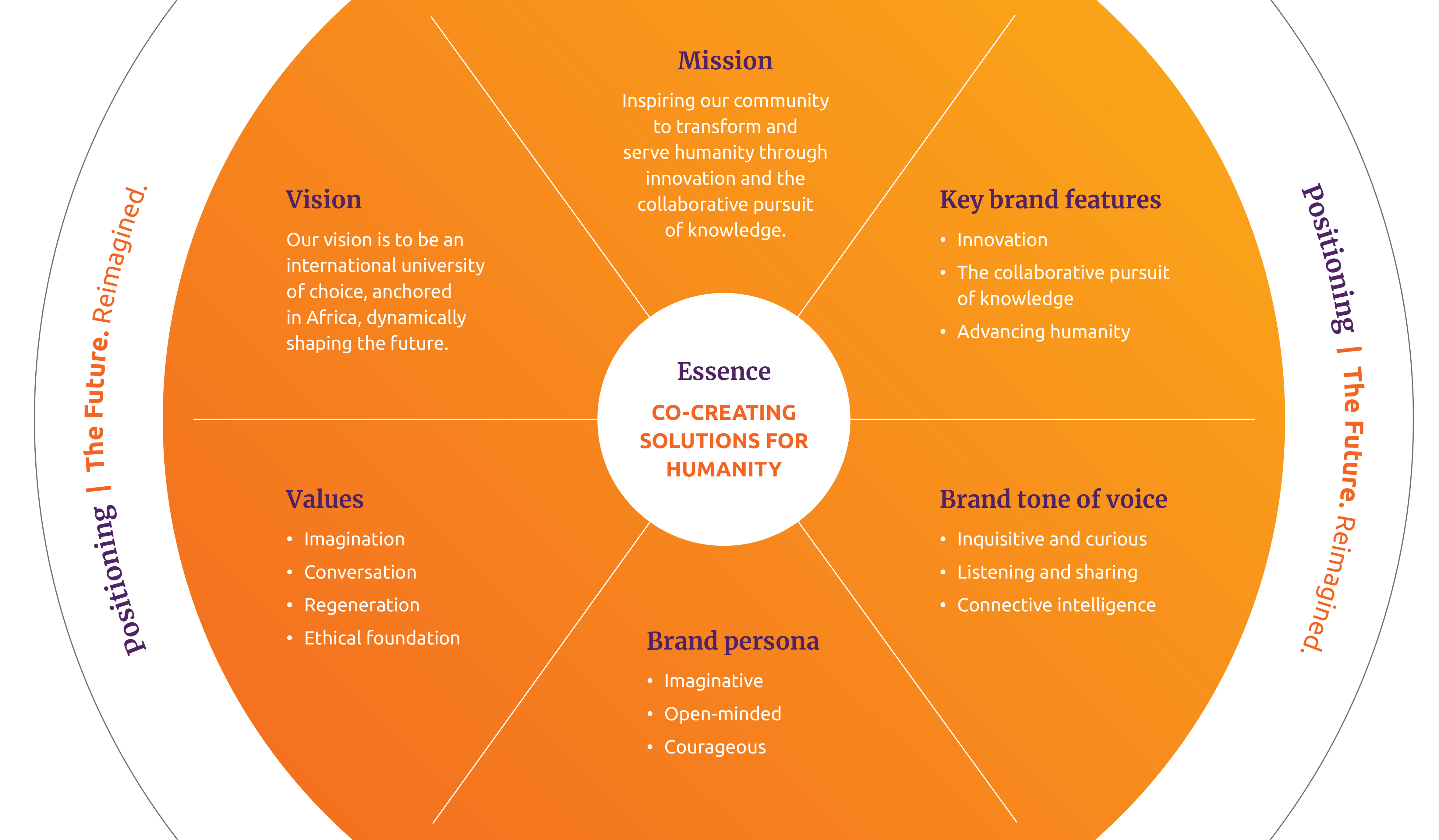
UJ brand values


What we stand for and how we behave.
Imagination
Freedom, innovation and independence to dynamically shape a resilient future
- Shaping the future
- Thinking independently
- Developing a cosmopolitan logo
- Exhibiting ambition and drive
- Adopting entrepreneurial approaches
Conversation
Collective intelligence + connecting intelligence = connective intelligence
- Learning together through diversity
- Making wise decisions collectively
- Engaging meaningfully with one another
- Displaying mutual respect
- Leading consultatively
Regeneration
Seeing fresh opportunities and connections, where others see none
- Developing sustainability through creative collaboration
- Introspection for renewal
- Innovating for the common good
- Making positive change
- Taking advantage of overlooked opportunities
Ethical foundation
Respecting and advancing each other and humanity
- Treasuring academic freedom
- Seeking balance in the pursuit of knowledge
- Facing challenges with courage and earning trust
- Acting responsibly by being fair, consistent and transparent
- Participating in and helping the community (ubuntu)
Architecture
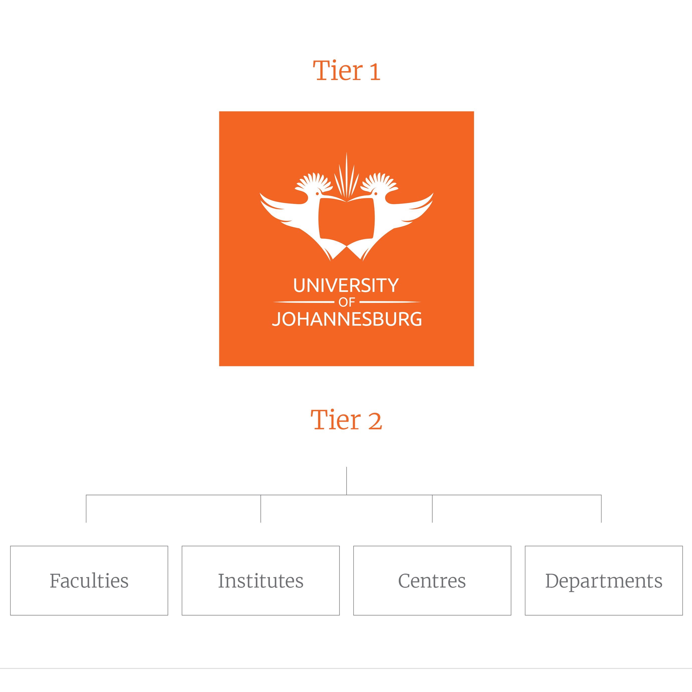
The objective is to reinforce the monolithic structure of which UJ is the mother brand and the rest of the institutional levels, together with the UJ logo, form the sub-brands.
Architecture based on a two-tier layering system:
Tier 1 is always the UJ brand as it holds the most equity. All UJ brand and campaign communication will make use of the tier 1 logo.
Tier 2 allows for differentiation between UJ faculties depending on which entity is leading the communication.
The use of a descriptor is reserved only for faculties. Other entities do not have a descriptor. Tier 2 is only implemented when the piece of communication is specifically from a faculty or aimed at a specific faculty audience.
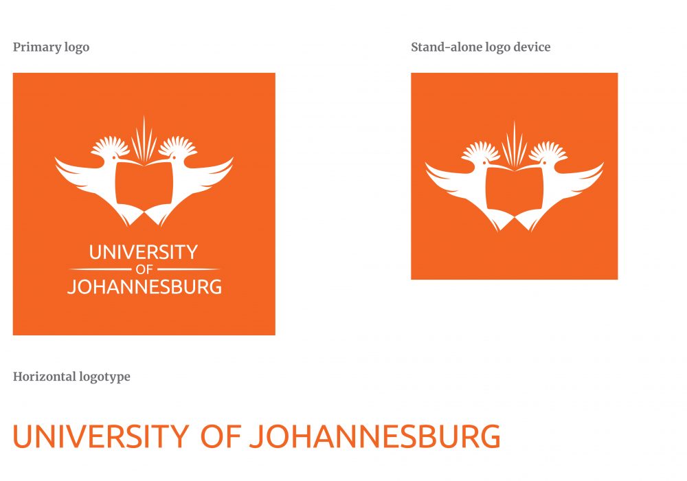
UJ logos
Apart from our primary logo, we have added two extreme impact logos to accommodate very small applications for digital and special printed items.
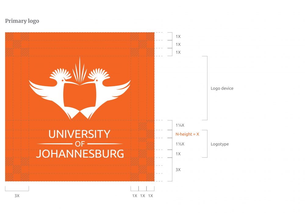
Primary logo
The refined primary logo with OpenType features is specially developed for clarity on digital screens.
The UJ logo consists of two main design elements: the logo device and the logotype. The logotype has been adjusted to the OpenType/Google Font, Ubuntu, to ensure a crisp and digitally relevant logo.
This primary logo is the preferred logo to be used on all collateral. However, there are application exceptions.
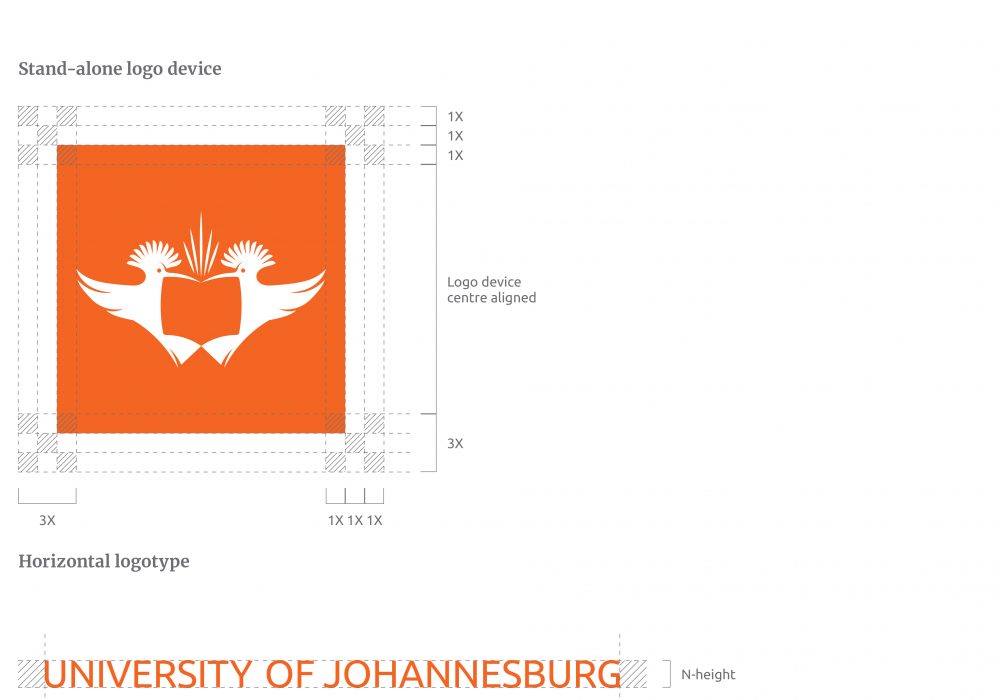
The N-height of the university logotype determines the X-height. The X-height creates a manageable grid inside the holding shape in which the logo sits.
Maximum impact logos
The X-height grid can easily be adapted to a proportionally smaller holding shape that only contains the logo device.
The UJ maximum impact logos consist of two main logos: the logo device and the horizontal logotype. There are application exceptions.
Stand-alone logo device
The UJ orange square is made proportionally smaller to create a logo that can accommodate smaller application elements, i.e. digital banners.
Horizontal logotype The height of the horizontal logotype gives you the Y value. This logo has been created to accommodate extremely small application elements, i.e. pens.
Minimum clear space
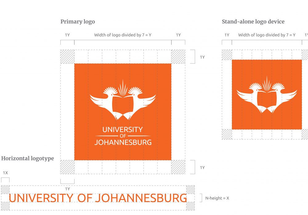
The clear space on all marketing material is determined by the Y-value, which is determined by the holding shape divided by seven.
In order for the logo to create maximum impact, it is important to keep the space around the logo free from copy and graphics. This clear space area around the logo ensures prominence, integrity and professionalism.
The minimum clear space around the UJ logos are 1Y, with the exception of the horizontal logotype which has a 1X clear space.
Incorrect usage
In order to maintain the integrity of the UJ logo, it is important to adhere to these guidelines
Incorrect usage
- Do not display the reversed logo on UJ orange or any other flat colour except 70% grey.
- Do not display the reversed logo on the UJ orange gradient.
- Do not display the reversed logo on the 70% grey gradient.
- Do not display the logo without the holding shape.
- Do not display the logo with a key line placed around its holding shape.
- Do not change the holding shape colour.
- Do not deviate from the correct corporate colour usage.
- Do not display the reversed logo on visuals.
- Do not alter the logo in any way.

Minimum sizes
Remember to select the right choice of logo according to the placement and size on an element
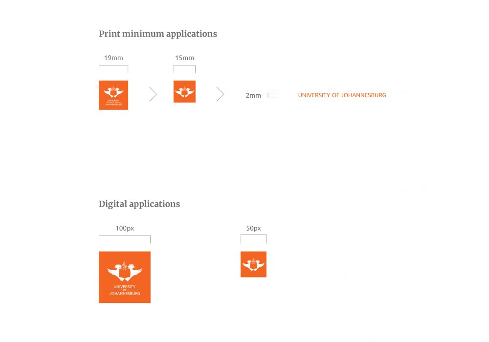
In order to maintain the integrity of the logo, minimum sizes have been established to which the various versions of our logos must be applied.
Our preferred primary logo may not be applied at a size smaller than 19mm wide. Whenever it gets placed smaller than 19mm, the logotype drops off and we use the logo device. The stand-alone logo device may not be applied at a size smaller than 15mm in width. The horizontal logotype may not be applied at a size smaller than 2mm N-height.
Our preferred primary logo may not be digitally applied at a size smaller than 100px wide. Whenever it gets placed smaller than 100px, the logotype drops off and we use the logo device. The stand-alone logo device may not be used on digital at a size smaller than 50px wide.
Faculty logos
The faculties consist of eight entities, of which one is a college.

Logo construction
The refined primary logos with OpenType features are specially developed for clarity on digital screens.
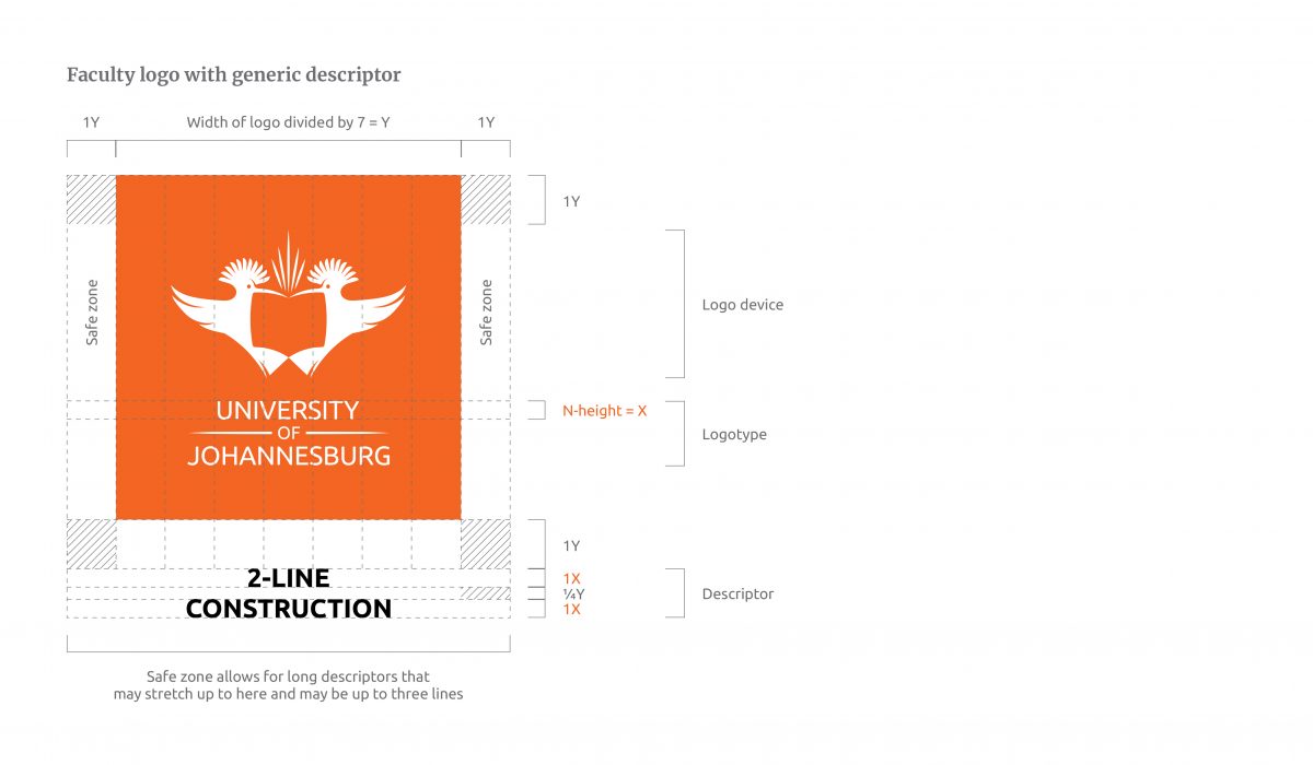
The faculty logo consists of three main design elements: the logo device, the logotype and the descriptor. The logotype has been adjusted to the OpenType/Google Font, Ubuntu, to ensure a crisp and digitally relevant logo.
This primary logo is the preferred logo to be used on all collateral. However, there are other logo options for application exceptions of extreme sizes.
The N-height of the university logotype determines the X-height. The height of the descriptor is determined by the X-height. The descriptor is placed as the OpenType/ Google Font, Ubuntu.
Special printing guidelines
In order to maintain the integrity of the UJ logo, it is important to adhere to these guidelines.
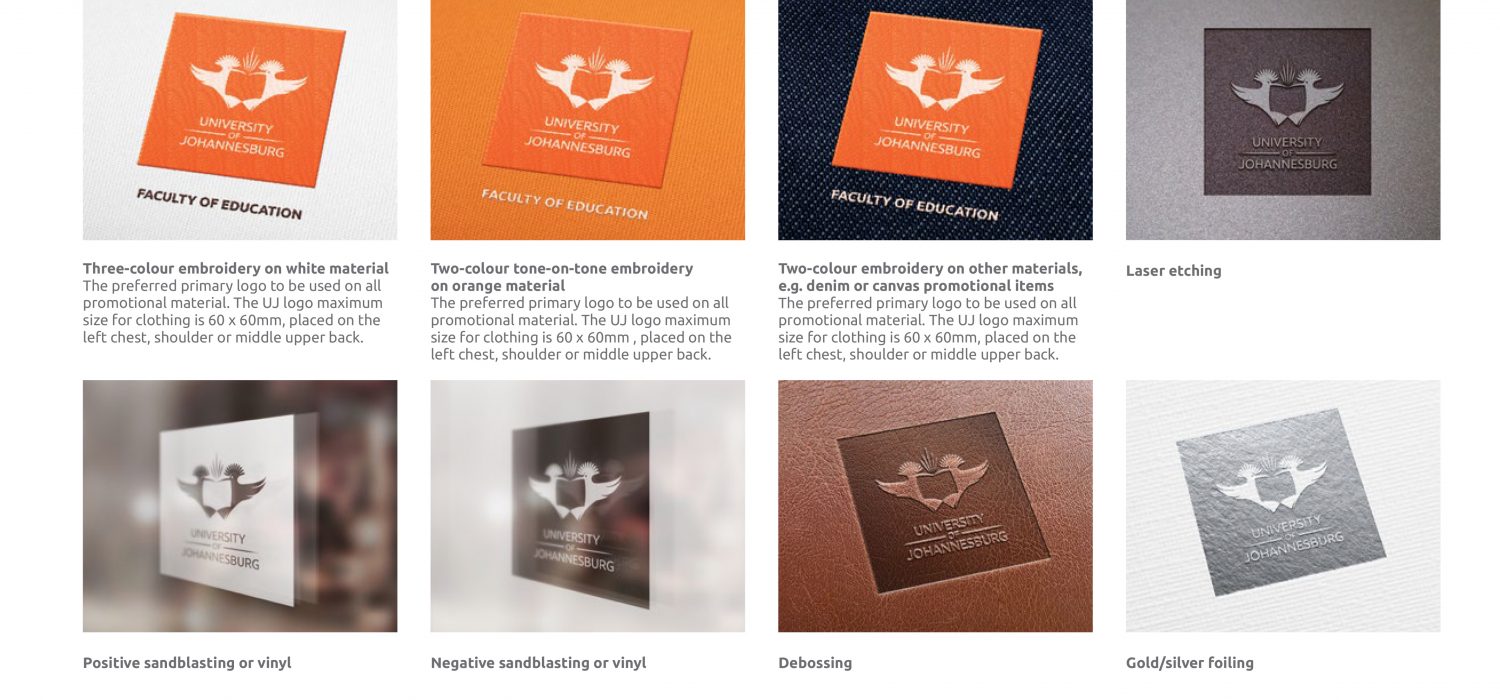
The examples provided on the right show the accepted and approved forms of embroidery, silk screening, sandblasting, engraving and debossing on different materials. Retain the holding shape square at all times. The UJ logo may be applied by itself or along with its descriptor.
Payoff line
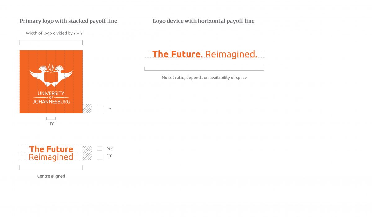
The payoff line has been recreated as a stacked and horizontal option in the Ubuntu font.
The examples show the proportions and relationship between the UJ primary logo and the payoff line. The primary logo and stacked payoff line relationship is preferred. The payoff line should be placed at a height of 1½Y. These may not be placed as a lockup together. If there is a space restriction, for example, mobile banners, we only place the logo device without the logotype. There is no set ratio for the application of the payoff line and the logo device together; this is up to the space available and the discretion of the designer.
Please contact the Brand Office for more information: marketingbrand@uj.ac.za
